
Replace. — Brand Identity Case

Logomark
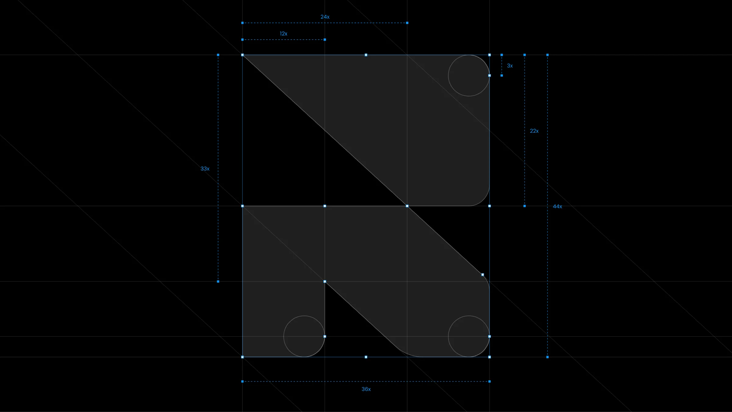
The logomark is the compact form of our identity. Two counter-facing arrows describe a single motion — one form moving out, another moving in. Use it as a standalone identifier in favicons, avatars, and app icons, or wherever the full wordmark would compete with the layout.
Typography & color
Malibu
Zircon
Mirage
Inter
Inter carries display and body — monolinear strokes that stay calm at large sizes and open at small. Geometry and legibility pull in opposite directions — we choose rather than compromise.
Picton blue — 11 steps
Inside look
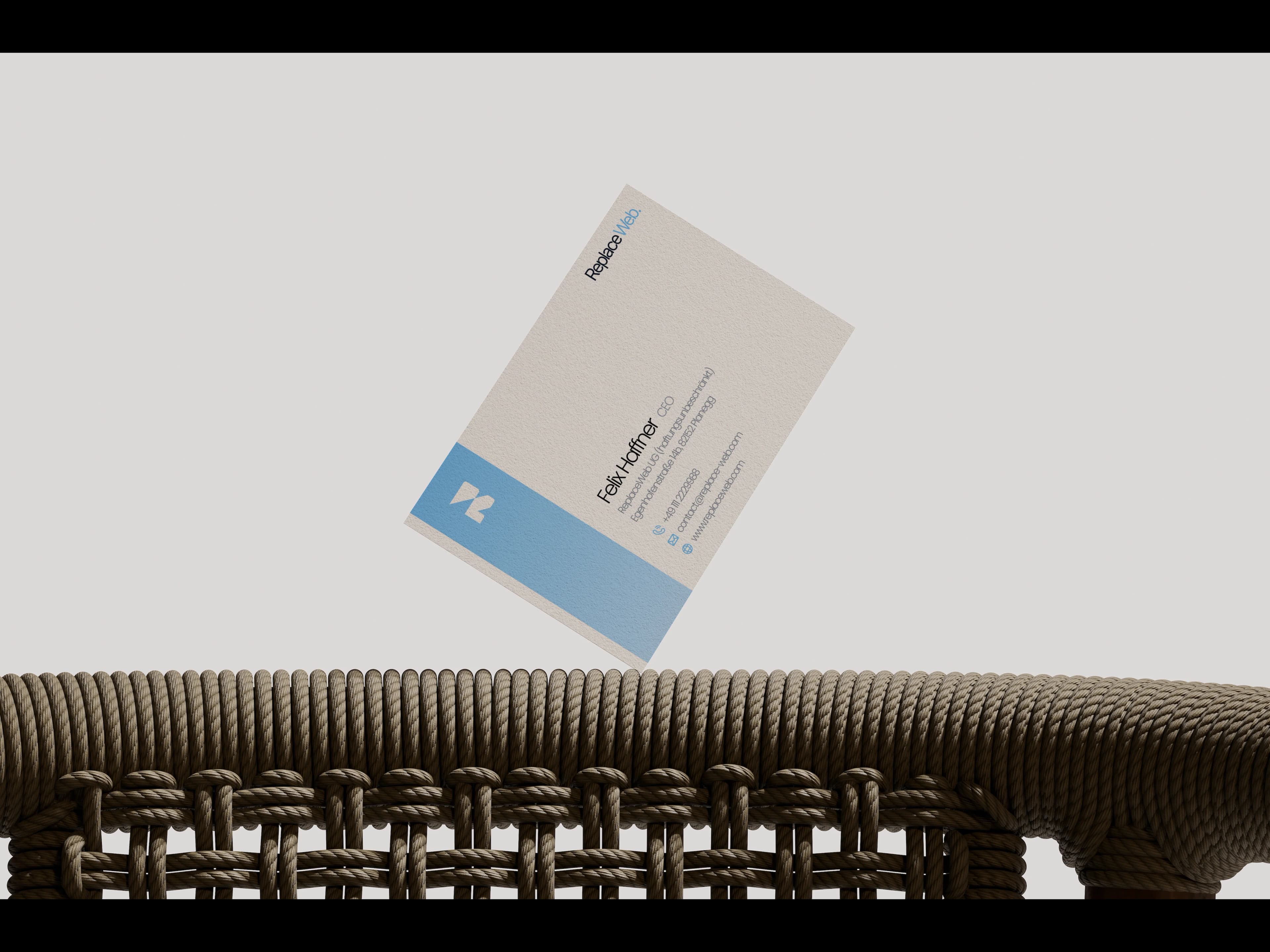
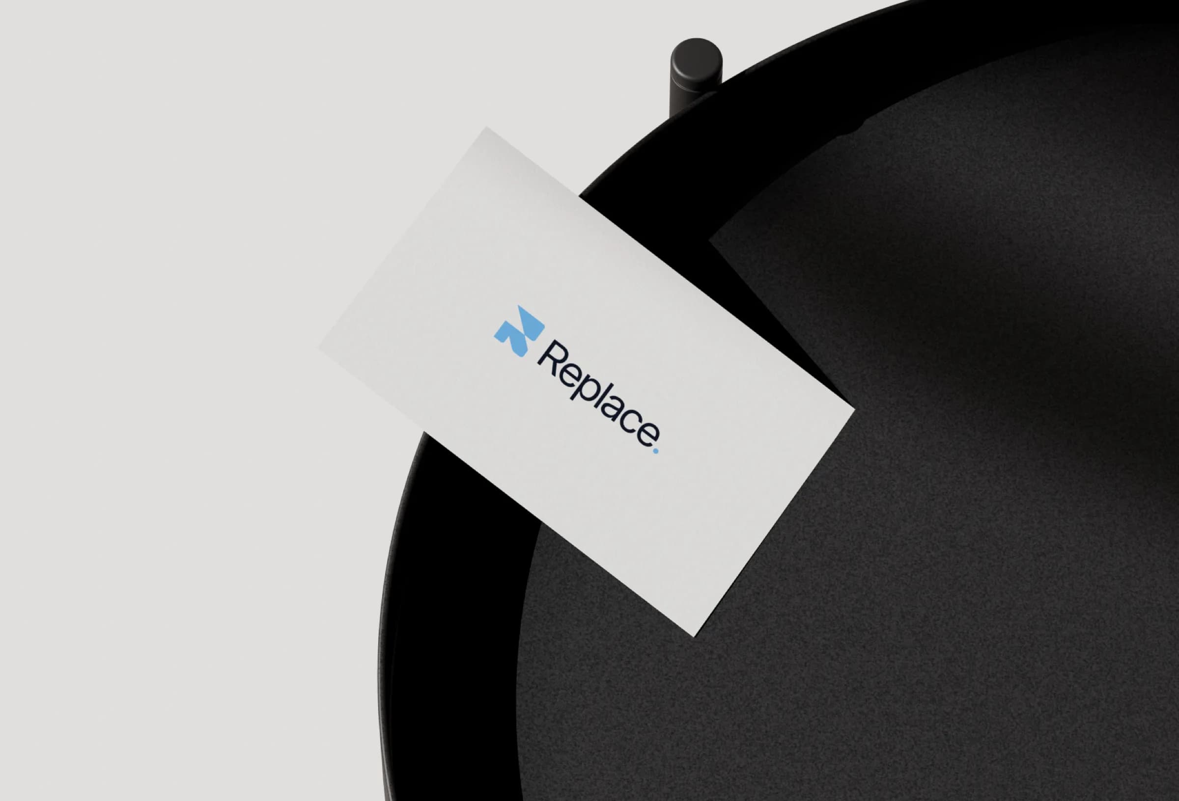
Business card — brand identity made tangible.

Business card — front 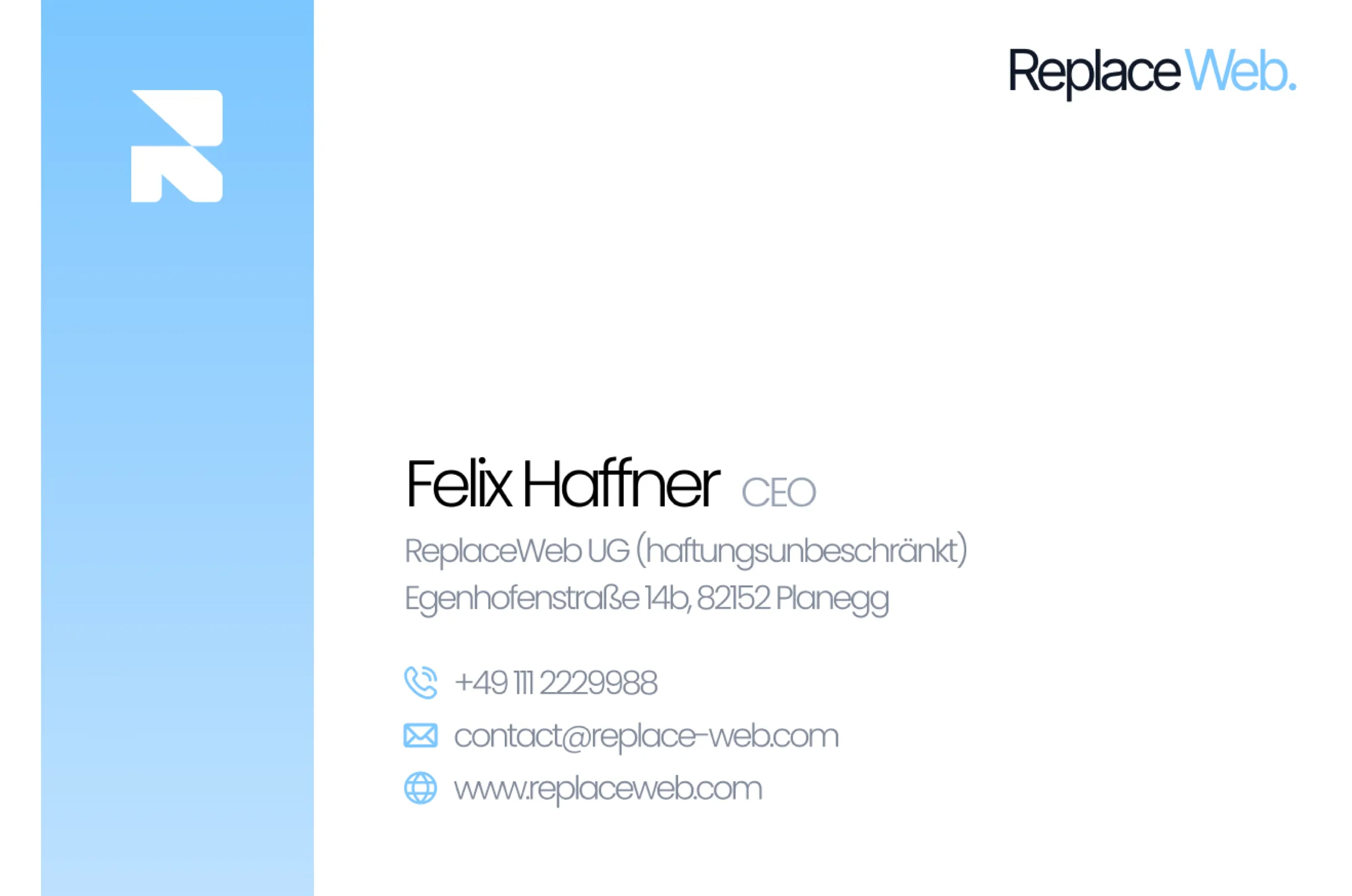
Business card — back
Deliverables
- Wordmark & mark
- Color system (11 steps)
- Inter type system
- Brand guidelines
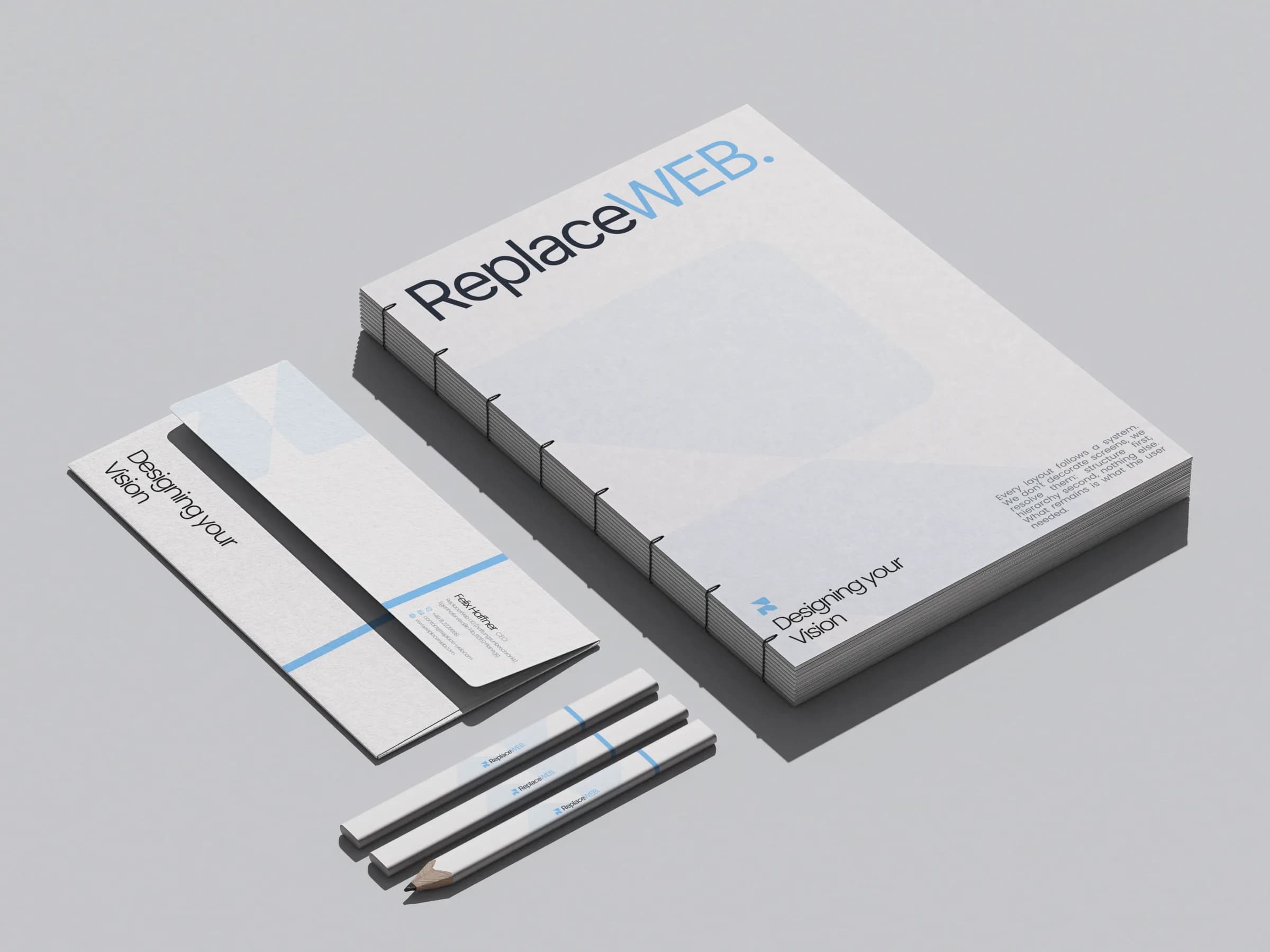
- Business card & letterhead
- Digital surface
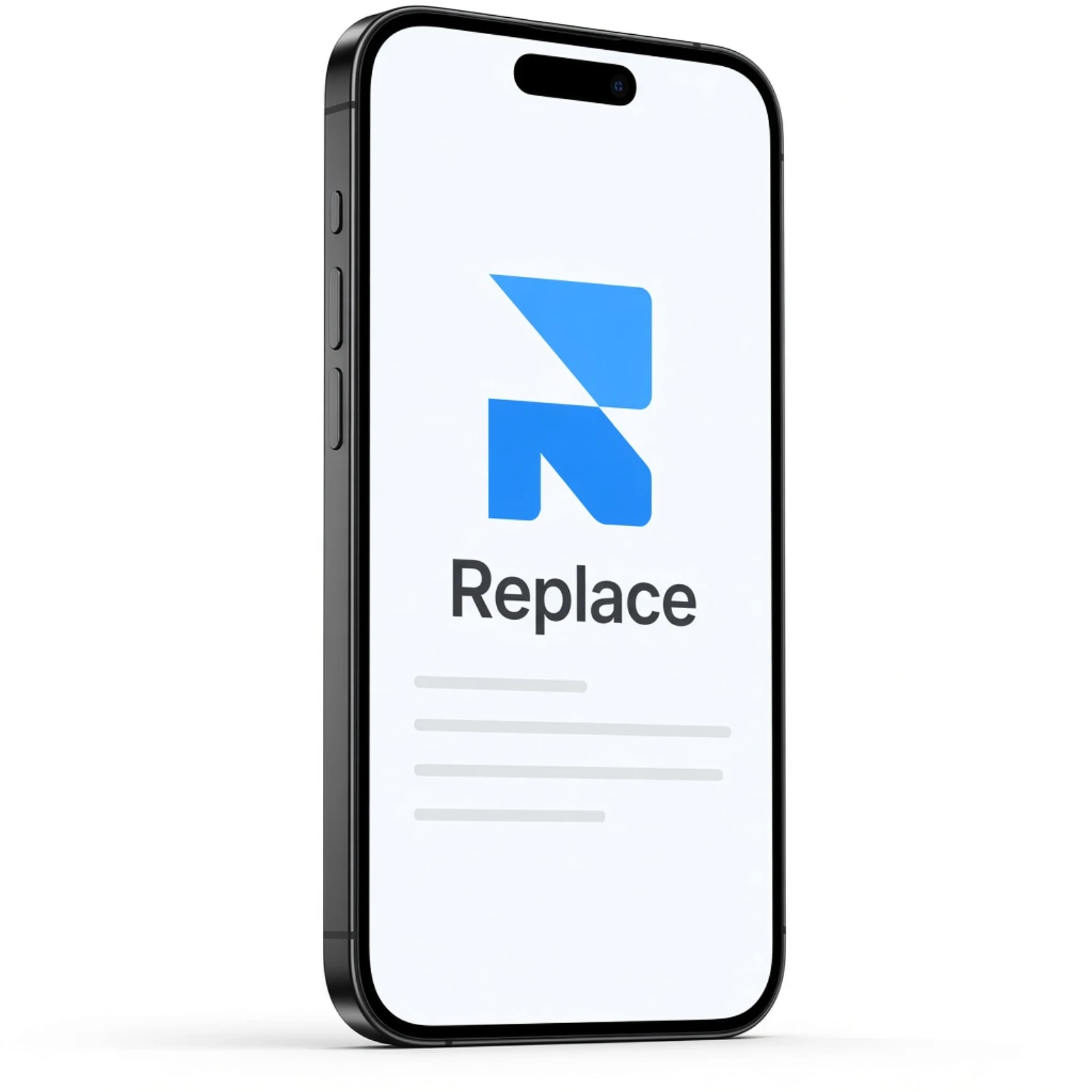
Replace. app icon and iPhone mockup on a home screen




Next case study
k2.kommBrand presence for communication in science and business — precise, trustworthy, networked.View case Back to overviewAll branding projects