
Communication is the simplest tool we have, and the hardest to use well.
k2.komm — Brand Identity Case
Wordmark
k2.komm runs on precision — the wordmark sits on a clear grid, with fixed proportions between k2., komm, and the tagline kommunikation im netzwerk. Shiraz as accent, Blue Bayoux as calm — readable on screen, in print, and in space.
Typography & color
Shiraz
Blue Bayoux
Black Haze
Heading
Avenir Next
Avenir Next carries the headlines — geometric, but warmed by humanist detail. Clear at large sizes, confident in the hierarchy between science and business.
Body
Montserrat
Montserrat for body copy and labels — wide letterforms, tall x-height, readable on screen and in guidelines.
Neutral — black scale
Deliverables
- Wordmark & construction grid
- Shiraz / Blue Bayoux color system
- Avenir Next & Montserrat typography
- Brand guidelines
- Business card & letterhead
- Digital surface & social templates
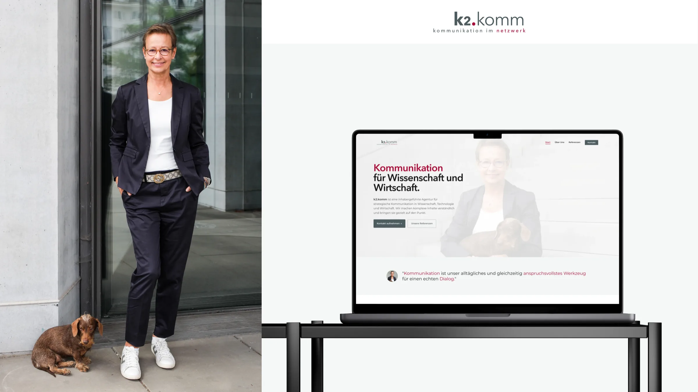
k2.komm browser chrome and social profile mockup — digital brand surfaces

Next case study
Replace.Brand identity with wordmark, color system, and digital surface — clear offer, calm impact.View case Back to overviewAll branding projects